Blue has long been regarded as a precious and meaningful color. As early as the 14th century, it held exceptional value in art: ultramarine, derived from lapis lazuli, was the most expensive pigment available and was reserved for the most important elements, such as the Virgin Mary’s robe in religious paintings.
Today, centuries later, blue continues to dominate color trends, especially in interior design. Its enduring appeal is reflected in contemporary palettes, such as those proposed for 2026, where multiple
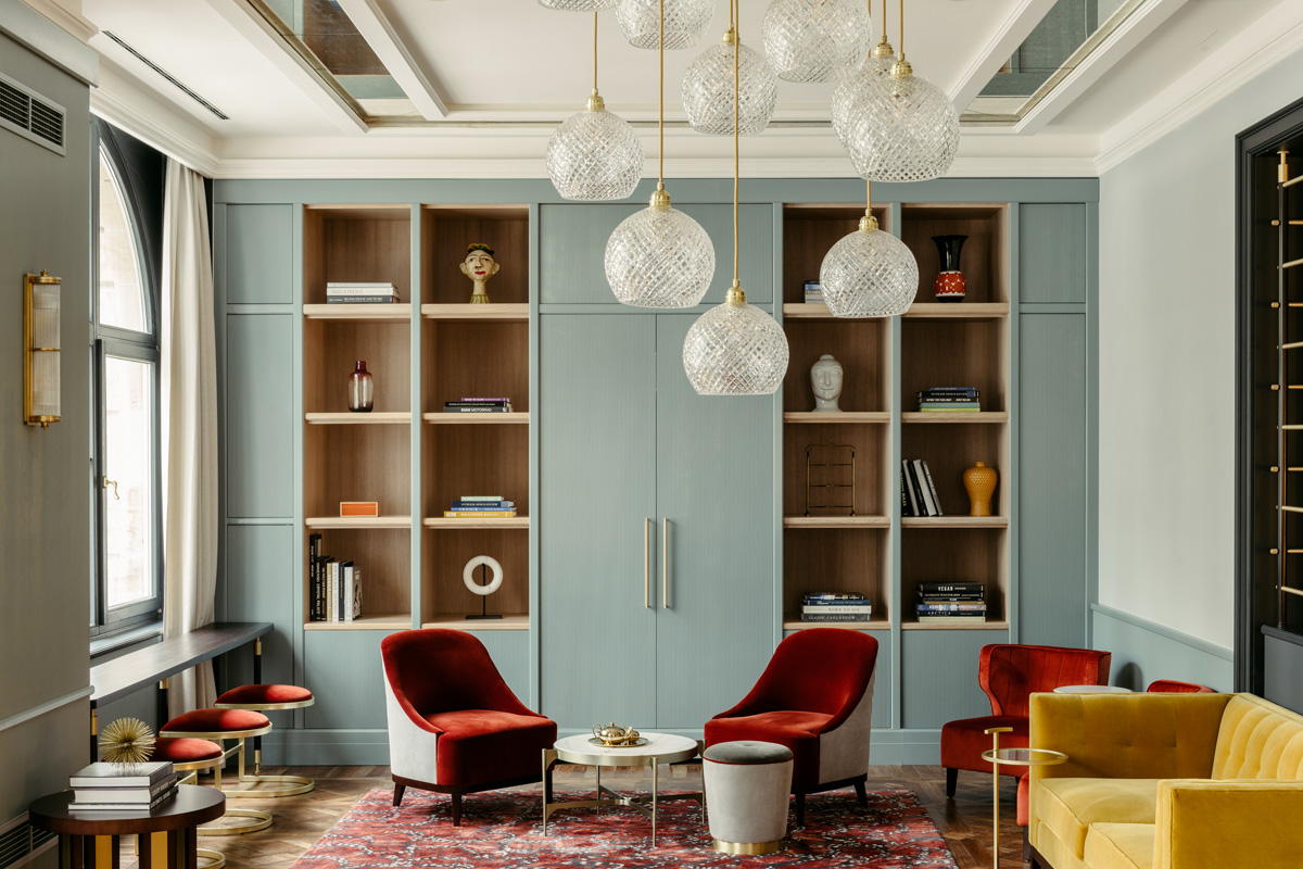
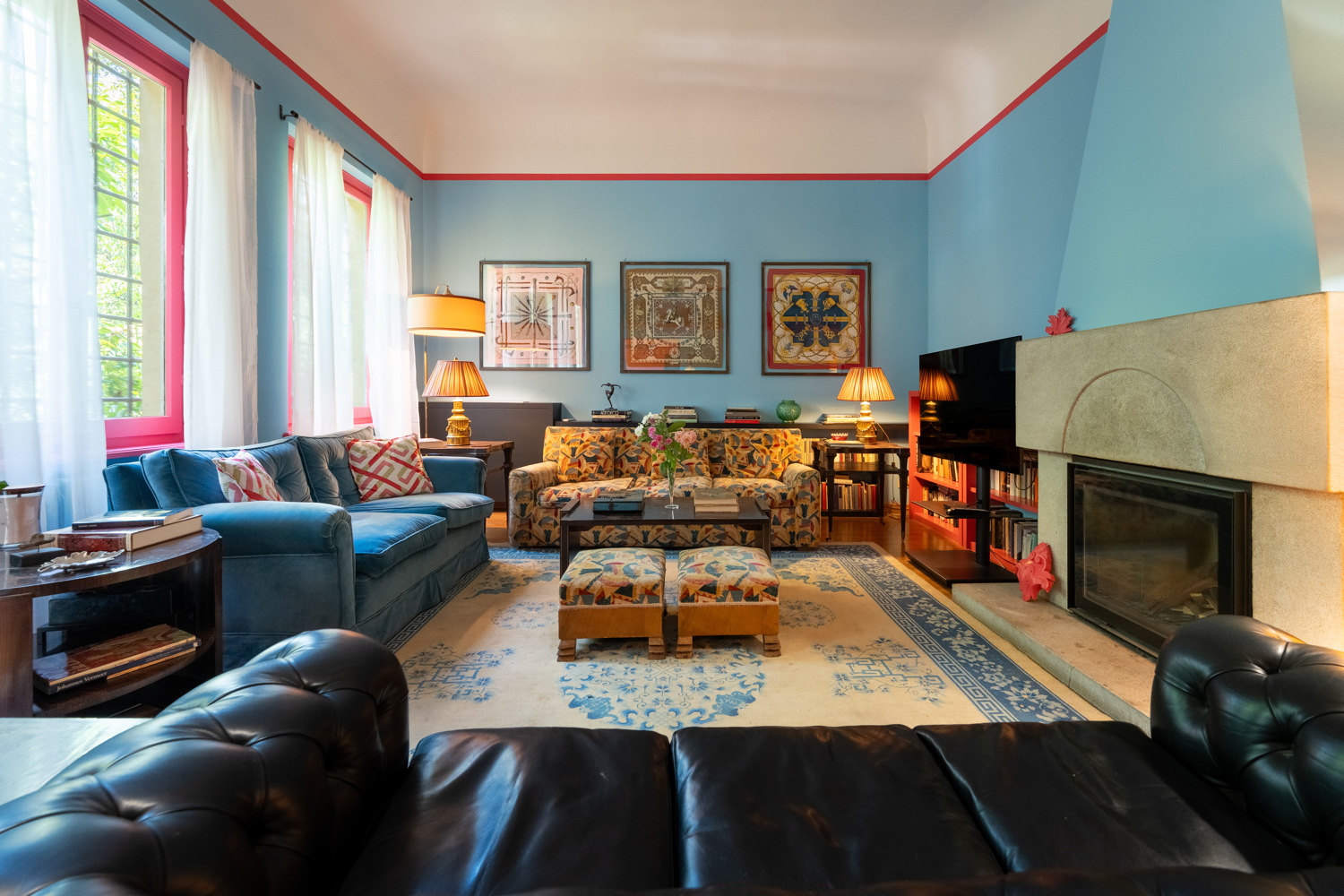
shades of blue are used to create different moods and styles. Looking ahead, trend forecasters suggest that a bright blue will also play a key role in 2027. For now, softer tones like sky blue, powder blue, and watery hues with green undertones—such as celadon—are particularly popular.
One of blue’s greatest strengths is its versatility. Deep, насыщенные tones like cobalt convey a bold, modern character, while muted, dusty variations evoke a more classic and timeless elegance. When paired with sea-inspired palettes, blue creates light and relaxing Mediterranean atmospheres, whereas greyish shades like “sugar paper” blue lend themselves to more creative and eclectic interiors.
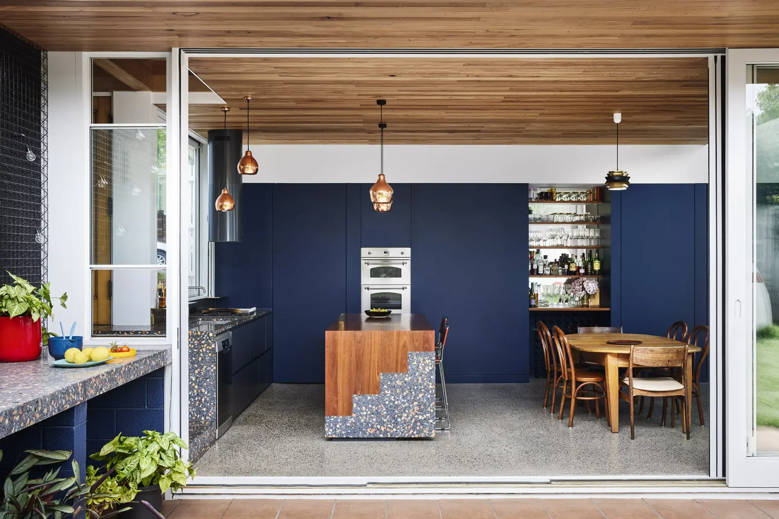
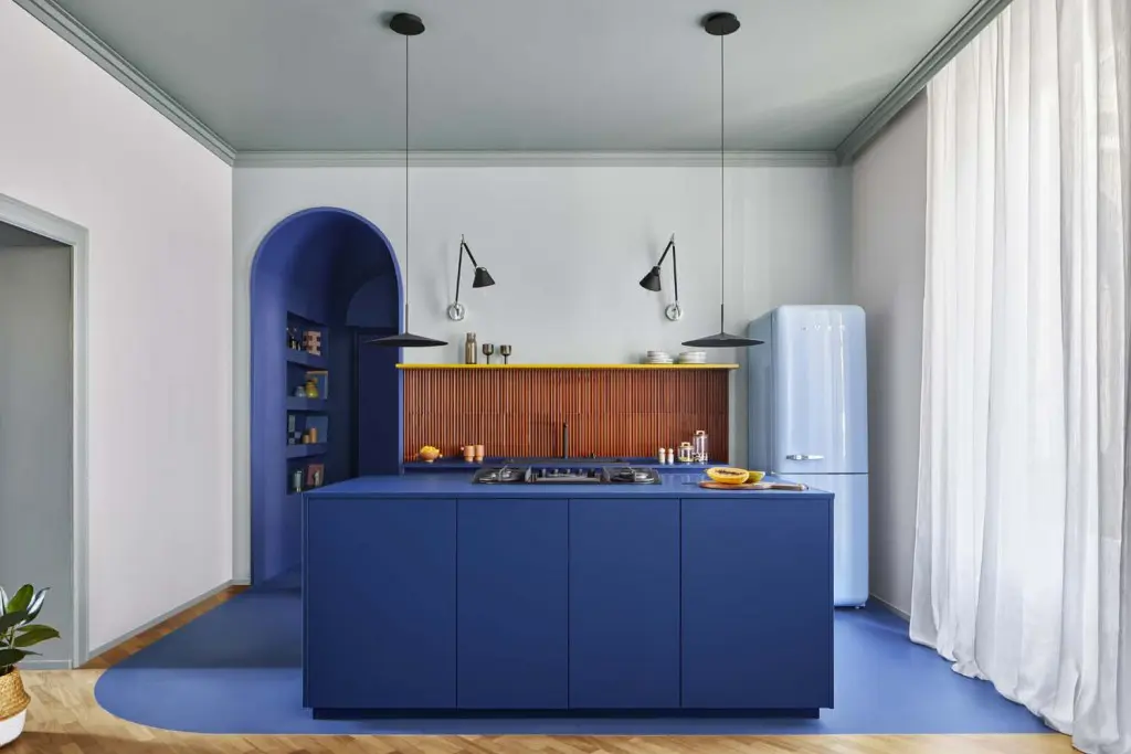
There are dozens of blue variations, ranging from vivid and mineral tones to softer or darker shades. These include well-known hues such as indigo, ultramarine, navy, Prussian blue, cobalt, sapphire, and Klein blue. Each carries distinct undertones—some leaning toward green and feeling more natural, others appearing almost black and creating dramatic, theatrical spaces.
Paint brands have developed signature interpretations of blue. Some offer contemporary mid-tones with subtle grey nuances, while others reinterpret historical shades inspired by classic European interiors. There are also delicate, light-filled blues that shift depending on lighting, creating calm and refined atmospheres, as well as intense artistic tones inspired by iconic pigments like Yves Klein’s ultramarine.
In interior spaces, blue can serve as a subtle backdrop or a strong visual statement, adapting easily to living rooms, bedrooms, and beyond. Whether soft and airy or deep and striking, it remains one of the most expressive and adaptable colors in design.